
Angular 9 has been one of the major releases of angular. There has been a lot of exciting stuff that been introduced in this respective release. And also they have introduced some cool components such as YouTube Player, Clipboard CDK, and Google Maps.
In this blog, we are going to explore how we can integrate Google Maps in our respective angular application.
Steps to Implement Google Maps
STEP 1:
You have created an API key in the GoogleMaps platform. Goto this respective link and at the top, we have a dropdown. Select that and you would be able to create a new project.

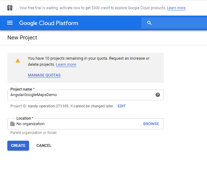
STEP 2:
On the top right, we will have New Project click that and mention the respective project name and click Create.
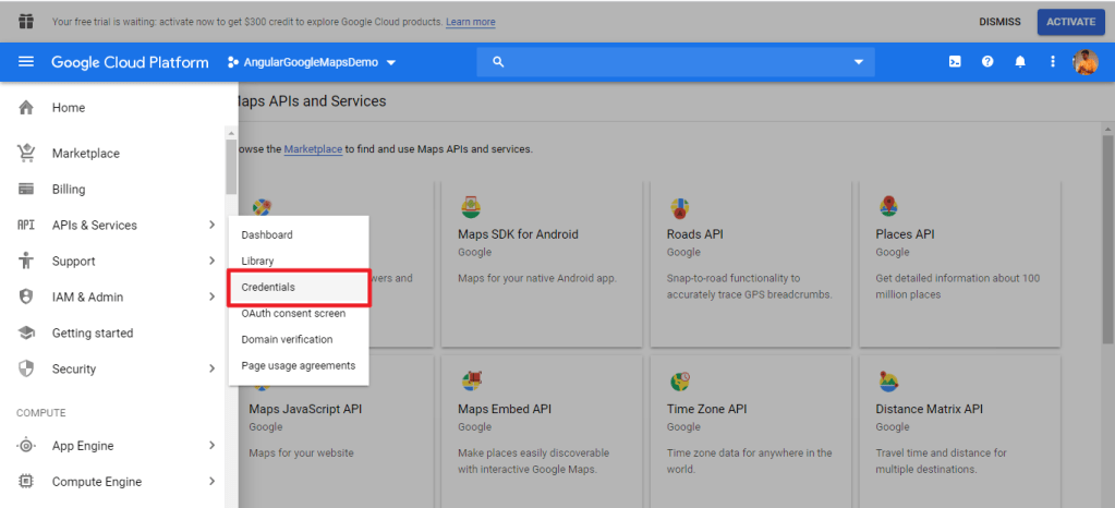
STEP 3:
Once the project is created, on the top left we have the menu button, click that and select APIs & Services -> Credentials.
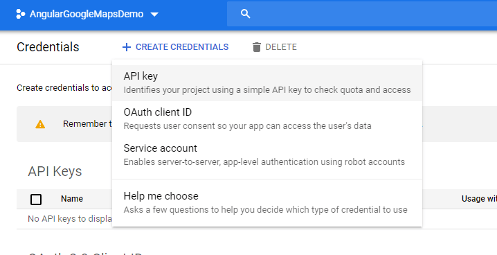
STEP 4:
On the Credentials page, click Create credentials > API key.
The API key created dialog displays your newly created API key.

STEP 5:
Once we got the API key to let us try to use Google Maps in our applications. Install the respective module into your angular application.
npm install @angular/google-mapsSTEP 6:
Import GoogleMapsModule in your respective app.module.ts and make sure you also add this module to the import array.
import { BrowserModule } from '@angular/platform-browser';
import { NgModule } from '@angular/core';

import { AppComponent } from './app.component';
import { GoogleMapsModule } from '@angular/google-maps';

@NgModule({
  declarations: [
    AppComponent
  ],
  imports: [
    BrowserModule,
    GoogleMapsModule
  ],
  providers: [],
  bootstrap: [AppComponent]
})
export class AppModule { }
STEP 7:
So now go to index.html and provide your maps API key. Replace yourkey with your respective API key.
https://maps.googleapis.com/maps/api/js?key=yourkeySTEP 8:
Now just place this element into your respective component.
<google-map> </google-map>That’s it you have implemented Google Maps into your respective applications
Google Maps Options
Let us explore about the @Input() attributes and @Output() events that you can send it to respective google map component.
@Input()
Using these input parameters you should be able to customize your maps based upon your need. You can set height, width and also you can set some predefined options using MapOptionsInterface provided by Google API.
- width – Sets the initial width
- height – Sets the initial height
- center – Used to set the initial center of the map
- zoom – Sets the zoom options
- – Set predefined options from MapOptionsInterface.
Using options, you can make full use of customizing your google maps. So let us see what are all the options available by MapOptionsInterface.
| Property | Description |
| backgroundColor | Type: string |optional
Sets the background color of the map |
| center | Type: LatLng|LatLngLiteral | optional
Used for centering the map |
| clickableIcons | Type: boolean |optional
When false => map icons not clickable |
| controlSize | Type: number |optional
Provide the size in pixels of the controls appearing on the map. |
| disableDeafultUI | Type: number |optional
Used to enable/disable the default UI |
| disableDoubleClickZoom | Type: boolean |optional
When true => it disables zoom and center on double click |
| draggable | Type: boolean |optional
When true => it allows to drag the map It is deprecated but you can make use of gestureHandling property. |
| draggableCursor | Type: string |optional
Used to set the name or url of the cursor to display when mousing over a draggable map |
| draggingCursor | Type: string |optional
Used to set the name or url of the cursor to display when the map is being dragged |
| fullscreenControl | Type: boolean |optional
Initial Enabled/Disabled state of the full screen control. |
| fullscreenControlOptions | Type: FullScreenControlOptions |optional
Display options for the full screen control |
| gestureHandling | Type: string |optional
Used to set the gesture handles of your google map. The allows values are cooperative, greedy, none and auto. |
| heading | Type: number |optional
The heading for aerial imagery in degrees measured clockwise from cardinal direction north. |
| keyboardShortcuts | Type: boolean |optional
When it’s false => it disables the control of google maps from keyboard |
| mapTypeControl | Type: boolean |optional
Initial Enabled/Disabled state for the Map Type control. |
| mapTypeControlOptions | Type: MapTypeControlOptions |optional
The initial Display options for the Map Type control. |
| mapTypeId | Type: MapTypeId|string |optional
Initial Map MapTypeId. |
| maxZoom | Type: number |optional
Used to set the maximum zoom level which will be displayed on the map. |
| minZoom | Type: number |optional
Used to set the minimum zoom level which will be displayed on the map. |
| noClear | Type: boolean |optional
When its true => do not clear the contents of Map div |
| panControl | Type: boolean |optional
Initial Enabled/Disabled state for the Pan Control. |
| panControlOptions | Type: PanControlOptions |optional
The display options of the Pan control. |
| restriction | Type: MapRestriction |optional
Used to restrict the area of the google maps. |
| rotateControl | Type: boolean |optional
Initial Enabled/Disabled state for the Rotate control. |
| rotateControlOptions | Type: RotateControlOptions |optional
Initial display options for the Rotate control. |
| scaleControl | Type: boolean |optional
Initial enabled/disabled state for the Scale Control. |
| scaleControlOptions | Type: ScaleControlOptions |optional
Initial display options of the scale control |
| scrollwheel | Type: boolean |optional
When it’s false => it disables zooming By default its true. But google recommends to use gestureHandling property to disable zomming. |
| streetView | Type: StreetViewPanorama |optional
A StreetViewPanorama to display when the Street View Pegman is dropped on the map. |
| streetViewControl | Type: boolean optional
Used to initialize the enabled/disabled state of the Street View Pegman control. |
| streetViewControlOptions | Type: StreetViewControlOptions |optional
Used to initialize the display options for the Street View Pegman control. |
| styles | Type: Array<MapTypeStyle> |optional
Used to apply style to each one of the default map Types. |
| tilt | Type: number |optional
Used to control the automatic switching behavior for the angle of incidence of the map |
| zoom | Type: number |optional
The initial map zoom level |
| zoomControl | Type: boolean |optional
Enabled/Disabled state of the zoom control |
| zoomControlOptions | Type: ZoomControlOptions |optional
Display options for the zoom control |
So these input attributes can be used as,
app.component.html
<google-map
   height="100%"
   width="100%"
   [zoom]="zoom"
   [center]="center"
   [options]="options">
</google-map>
app.component.ts
export class AppComponent {
  zoom = 12
  center: google.maps.LatLngLiteral
  options: google.maps.MapOptions = {
    mapTypeId: 'hybrid',
    zoomControl: false,
    scrollwheel: false,
    disableDoubleClickZoom: true,
    maxZoom: 15,
    minZoom: 8,
  }
}
@Output()
There are various number of events that you can emit from google maps. Below is the list of events that you can emit.
| Property | Description |
| boundsChanged | This event is fired when the viewport bounds have changed |
| centerChanged | Event is fired when the map center property changes. |
| mapClick | Event is fired when the user clicks on the map. |
| mapDblclick | Event is fired when the user double clicks on the map. |
| mapDrag | Event is fired whenever the user drags the map. |
| mapDragend | Event is fired when use stops dragging the map. |
| mapDragstart | Event is fired when the user starts dragging the map. |
| headingChanged | Event is fired when the mapHeading property changes. |
| idle | Event is fired when the map becomes idle after panning or zomming. |
| maptypeidChanged | Event is fired when the mapTypeId property changes. |
| mapMousemove | Event is fired whenever the mouse moves over the map continer |
| mapMouseout | Event is fired when the user’s mouse exits the map container. |
| mapMouseover | Event is fired when the user’s mouse enters the map container. |
| projectionChanged | Event is fired when the projection has changed |
| mapRightclick | Event is fired when the DOM context menu is fired on the map container. |
| tilesLoaded | Event is fired when the visible tiles have finished loading |
| tiltChanged | Event is fired when the map tilt property changes |
| zoomChanged | Event is fired when the map zoom property changes |
Here’s how you can use events in your respective google map component.
app.component.html
<google-map
   (mapDragstart)="onDragStart()"
   (mapDragend)="onDragEnd()">
</google-map>
app.component.ts
export class AppComponent implements OnInit {
   onDragStart(){
      console.log("Drag Started....");
   }

   onDragEnd(){
      console.log("Drage Ended....");
   }
}
@ViewChild()
You can also use some useful functions and getters, if you can access your google map component using ViewChild. Here are the methods and getters that you can make use of from ViewChild.
| Methods | Description |
| fitBounds | Sets the viewport to contain the given bounds |
| panBy | Changes the center of the map by the given distance in pixels |
| panTo | Changes the center of the map to the given LatLng |
| panToBounds | Pans the map by the minimum amount necessary to contain the given LatLngBounds |
| getBounds | Returns the lat/lng bounds of the current viewport |
| getCenter | Returns the position displayed at the center of the map |
| getClickableIcons | Returns the clickability of the map icons |
| getHeading | Returns the compass heading of aerial imagery |
| getMapTypeId | Returns the map type id |
| getProjection | Returns the current Projection |
| getStreetView | Returns the default StreetViewPanorama bound to the map, which may be a default panorama embedded within the map |
| getTilt | Returns the current angle of incidence of the map, in degrees from the viewport plane to the map plane |
| getZoom | Returns the current zoom |
| controls | Additional controls to attach to the map |
| data | An instance of Data, bound to the map |
| mapTypes | A registry of MapType instances by string ID |
| overlayMapTypes | Additional map types to overlay |
app.component.html
<google-map
   (mapDragstart)="onDragStart()"
   (mapDragend)="onDragEnd()"
   #googleMap>
</google-map>
app.component.ts
export class AppComponent {
   @ViewChild("googleMap",{static: false}) public googleMap: any;
   onDragStart(){
      console.log(this.googleMap.getClickableIcons());
   }

   onDragEnd(){
      console.log(this.googleMap.data);
   }
}
MapMarker
MapMarker component allows you to add markers to the respective maps. To do so add MapMarker component inside google-map.
It also can be customizable based upon your needs. Now let us explore about the @Input() properties, @Output() events and @Viewchild() methods and getters of the MapMarker component.
@Input()
- title – Sets the title of the MapMarker Component
- position – Sets the position of the MapMarker Component
- label – Sets the label of the MapMarker Component
- clickable – Set to true if you want to track mouse events
- options – Sets the options for the MapMarker Component
app.component.html
<google-map>
  <map-marker
    *ngFor="let marker of markers"
    [position]="marker.position"
    [label]="marker.label"
    [title]="marker.title"
    [options]="marker.options"
  >
  </map-marker>
</google-map>
app.component.ts
export class AppComponent {
  public markers = [
      {
          position: {
             lat: 25,
             lng: 50,
          },
          label: {
             color: 'red'
          },
          title: 'India Warning Location,
          options: { animation: google.maps.Animation.BOUNCE },
      },
      {
          position: {
             lat: 100,
             lng: 150,
          },
          label: {
             color: 'green'
          },
          title: 'India Safe Location,
          options: { animation: google.maps.Animation.BOUNCE },
      }
  ];
}
@Output()
Below are the number of events that you can use in MapMarker Component.
| Property | Description |
| animationChanged | Event is fired when the marker’s animation property changes. |
| mapClick | Event is fired when the marker icon is clicked. |
| clickableChanged | Event is fired when the marker’s clickable property changes. |
| cursorChanged | Event is fired when the marker’s cursor property changes. |
| mapDblclick | Event is fired when the marker icon was double clicked. |
| mapDrag | Event is fired whenever the user drags the marker. |
| mapDragend | Event is fired when the user stops dragging the marker. |
| draggableChanged | Event is fired when the marker’s draggable property changes. |
| mapDragstart | Event is fired when the user starts dragging the marker. |
| flatChanged | Event is fired when the marker’s flat property changes. |
| iconChanged | Event is fired when the marker icon property changes. |
| mapMousedown | Event is fired for a mousedown on the marker. |
| mapMouseout | Event is fired when the mouse leaves the area of the marker icon. |
| mapMouseover | Event is fired when the mouse enters the area of the marker icon. |
| mapMouseup | Event is fired for a mouseup on the marker. |
| positionChanged | Event is fired when the marker position property changes. |
| mapRightclick | Event is fired for a rightclick on the marker. |
| shapeChanged | Event is fired when the marker’s shape property changes. |
| titleChanged | Event is fired when the marker title property changes. |
| visibleChanged | Event is fired when the marker’s visible property changes. |
| zindexChanged | Event is fired when the marker’s zIndex property changes. |
Here’s how you can use events in MapMarker Component.
app.component.html
<google-map>
  <map-marker
    [position]="marker.position"
    [label]="marker.label"
    [title]="marker.title"
    [options]="marker.options"
    (mapMouseover)="onMouseOver()"
    (mapMousedown)="onMouseDown()">
  </map-marker>
</google-map>
app.component.ts
export class AppComponent {
  public markers =
      {
          position: {
             lat: 25,
             lng: 50,
          },
          label: {
             color: 'red'
          },
          title: 'India Warning Location,
          options: { animation: google.maps.Animation.BOUNCE },
      };

  onMouseOver(){
     console.log("Mouse hovered on Map Marker Component....");
  }

  onMouseDown(){
     console.log("Mouse Down on Map Marker Component.....");
  }
}
@ViewChild()
Below are the list of methods and getters that can be used in MapMarker Component.
| Methods | Description |
| getAnimation | Gets the animation of the respective marker. |
| getClickable | Gets the boolean value if the marker is clickable or not. |
| getCursor | Gets the cursor value of the marker. |
| getDraggable | Gets the boolean value if the marker is draggable or not. |
| getIcon | Gets the icon value of the marker |
| getLabel | Gets the MarkerLabel of the marker |
| getMap | Gets the content of the Map | StreetViewPanorama |
| getOpacity | Gets the opacity of the marker |
| getPosition | Gets the position of the marker. |
| getShape | Gets the shape of the marker |
| getTitle | Gets the title of the marker |
| getVisible | Gets the visibility of the marker |
| getZIndex | Gets the zindex of the marker |
| setAnimation | Sets the animation on the marker |
| setClickable | Sets the clickable property of the marker |
| setCursor | Sets the cursor property of the marker |
| setDraggable | Sets the draggable property of the marker |
| setIcon | Sets the icon property of the marker |
| setLabel | Sets the label of the marker |
| setMap | Sets the map of the marker |
| setOpacity | Sets the opacity of the marker |
| setOptions | Sets the options of the marker |
| setPosition | Sets the position of the marker |
| setShape | Sets the shape of the marker |
| setTitle | Sets the title of the marker |
| setVisible | Sets the visibility of the marker |
| setZIndex | Sets the zIndex of the marker |
Here’s how you can use it in MapMarker Component.
app.component.html
<google-map>
  <map-marker
    [position]="marker.position"
    [label]="marker.label"
    [title]="marker.title"
    [options]="marker.options"
    (mapMouseover)="onMouseOver()"
    (mapMousedown)="onMouseDown()"
    #mapMarker>
  </map-marker>
</google-map>
app.component.ts
export class AppComponent {
  @ViewChild("mapMarker",{static: false}) public mapMarker: any;
  public markers =
      {
          position: {
             lat: 25,
             lng: 50,
          },
          label: {
             color: 'red'
          },
          title: 'India Warning Location,
          options: { animation: google.maps.Animation.BOUNCE },
      };

  onMouseOver(){
     console.log(this.mapMarker.getVisible());
  }

  onMouseDown(){
     console.log(this.mapMarker.getZIndex());
  }
}
MapInfoWindow
MapInfoWindow component allows you to display some information of the respective marker.
This window can be triggered when you click on the respective marker.
app.component.html
<map-info-window>
   Map Info Window Component
</map-info-window>

<google-map>
  <map-marker
    [position]="marker.position"
    [label]="marker.label"
    [title]="marker.title"
    [options]="marker.options"
    (mapClick)="openMapInfoWindow(markerElem)">
  </map-marker>
</google-map>
You can access the MapInfoWindow using ViewChild and you should be able to open the respective info window.
app.component.ts
export class AppComponent{
  @ViewChild(MapInfoWindow, { static: false }) mapInfoWindow: MapInfoWindow

  openMapInfoWindow(mapMarker: MapMarker) {
    this.mapInfoWindow.open(mapMarker);
  }
}
@Input()
options – Sets the options for MapInfoWindow component
app.component.html
<map-info-window [options]="options">
    Map Info Window Component
</map-info-window>
app.component.ts
export class AppComponent{
  options: { animation: google.maps.Animation.BOUNCE };
}
There are lot of options available. You can make use of it based upon your need.
@Output()
Below are the list of events that you can emit from MapInfoWindow component.
| Property | Description |
| closeclick | Event if fired when the close button is clicked. |
| contentchanged | Event if fired when the content property changes. |
| domready | Event if fired when the <div> containing the InfoWindow’s content is attached to the DOM. |
| positionChanged | Event if fired when the position property changes. |
| zindexChanged | Event if fired when the InfoWindow’s zIndex changes. |
app.component.html
<map-info-window
 (closeClick)="closeMapInfoWindow()"
 (positionChanged)="positionChanged()"
 (contentChanged)="contentChanged()">
    Map Info Window
</map-info-window>
app.component.ts
export class AppComponent{
   closeMapInfoWindow(){
      console.log("Map Info Window closed....");
   }

   positionChanged(){
      console.log("Map Info Winodw position changed....");
   }

   contentChanged(){
      console.log("Content of the Map Info Window changed...");
   }
}
@ViewChild()
Below are the list of the methods and getters of MapInfoWindow component.
| Methods | Description |
| close | Closed the info window by removing it from the DOM |
| getContent | Gets the content from the info window |
| getPosition | Gets the position of the info window |
| getZIndex | Gets the zIndex of the info window |
| open | Opens the info window on the given map. |
Here’s how you can use it in MapInfoWindow Component.
app.component.html
<map-info-window
 (closeClick)="closeMapInfoWindow()"
 (positionChanged)="positionChanged()"
 (contentChanged)="contentChanged()"
 #mapInfoWindow>
    Map Info Window
</map-info-window>
app.component.ts
export class AppComponent{
   @ViewChild("mapInfoWindow",{static: false}) public mapInfoWindow: any;

   closeMapInfoWindow(){
      this.mapInfoWindow.close();
   }

   positionChanged(){
      this.mapInfoWindow.getPosition();
   }

   contentChanged(){
      this.mapInfoWindow.getContent();
   }
}
Conclusion
In this blog, we have explored about Google Map component which is officially released by the Angular team. And also we have explored the @Input() attributes, @Output() events and @ViewChild() methods that can be used in google-map, map-marker and map-info-window components.
There are various other components released in Angular 9 such as YouTube Player and Clipboard. We will explore it in our upcoming blogs.
Happy Coding!
Cheers!
 DevSuhas
Leave a comment